

Build once. Reuse across every screen.
Create reusable components, switch between light and dark themes, and share a design library across projects.
Available for macOS, Windows, and Linux. Also in VS Code and Cursor.
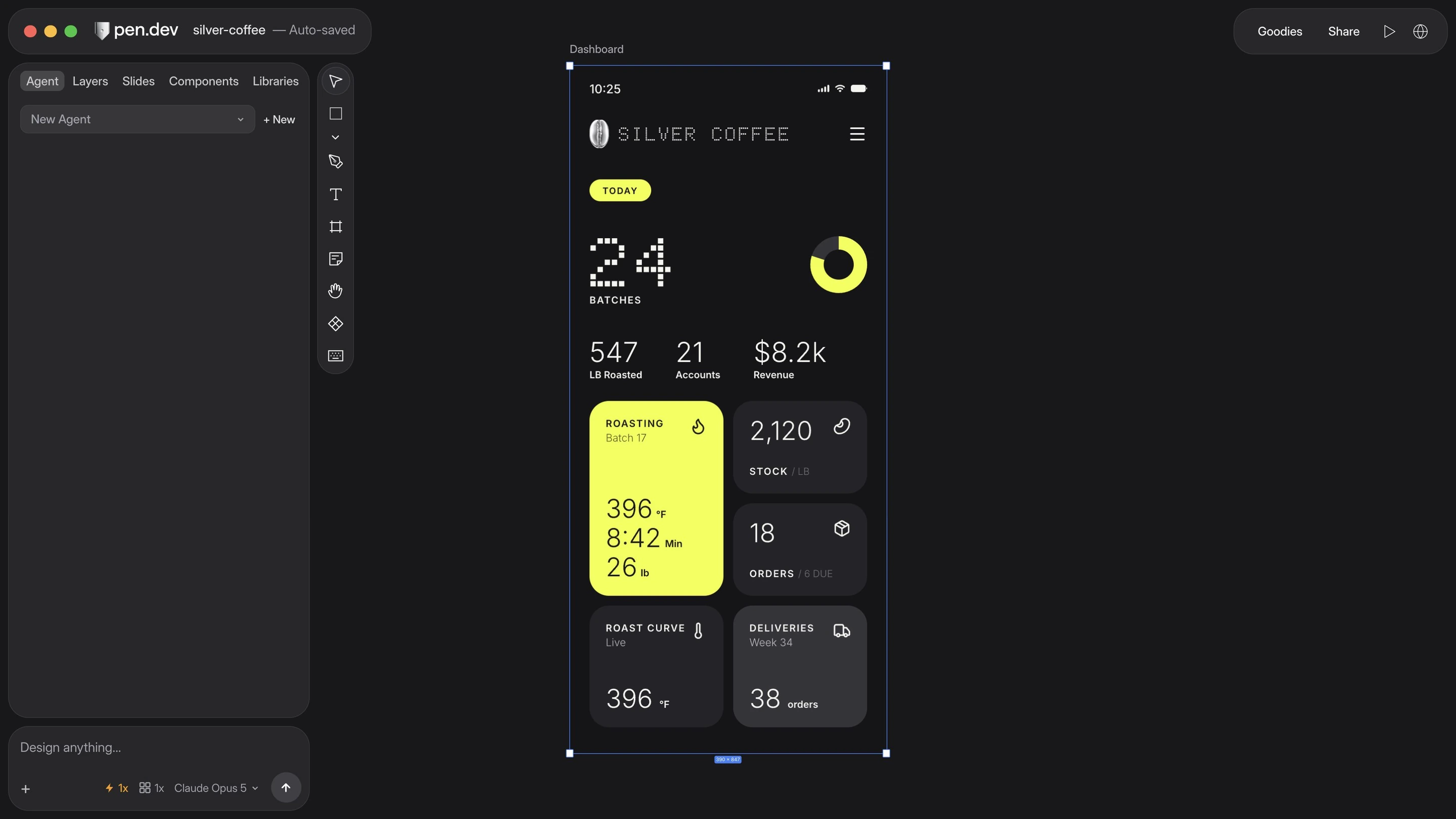
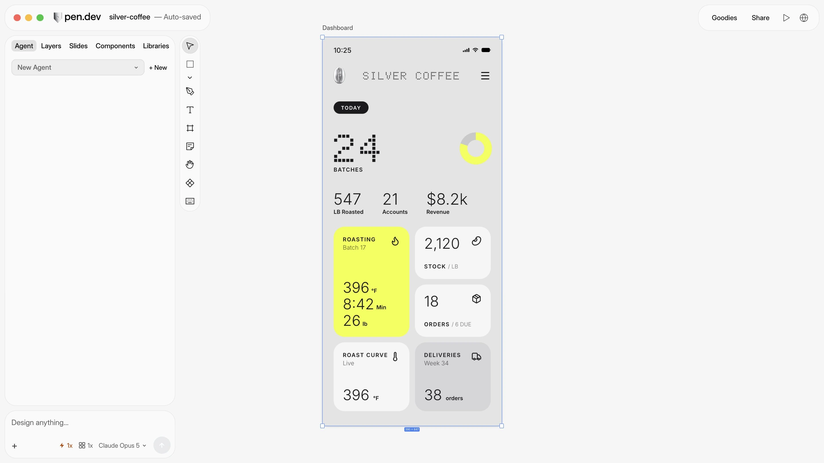


Components, themes, and shared libraries—ready to use.
| Feature |   | Paper |
|---|---|---|
| Create reusable components | Coming soon | |
| Switch light and dark themes | On the roadmap | |
| Keep shared components and styles in sync | Reopen to update | |
| Edit designs in VS Code or Cursor | ||
| Automate designs without opening the app | ||
| Export designs as SVG | ||
| Import editable Figma designs | Desktop app | Figma connection required |
| Choose from built-in icon libraries | Coming soon | |
| Comment on designs | ||
| Share design files | ||
| Share a link to your design | Snapshot links | |
| Edit together in real time | Coming soon |
Import from Figma or a webpage. Keep editing in pen.dev.

Import a Figma page with its images in the desktop app.
Turn a webpage into an editable design in the desktop app.
Give agents your project’s design rules to follow.
Shared components. Consistent screens.

Download pen.dev for macOS, Windows, or Linux, or add it to VS Code or Cursor.